Rounded Corners
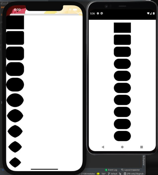
The other day I happened to notice an interesting question that Michał Zieliński shared in an Android Graphics channel that I frequent. He had observed that if he has a 40dp square and sets a 30dp corner radius, on Android the resulting shape looks the same as a 20dp corner radius. He then concluded that, unlike iOS, Android appears to clamp the corner radii of a rectangle to half of the shortest edge length.
He even created a sample app for each platfrom to demonstrate this issue.

I’ve also noticed this behavior on Android over the years and never thought anything of it, since it seems to make sense. This is the first that I’d heard that iOS behaves differently, however, and that piqued my interest, so I decided to dig a little deeper into the behavior to see why it might be different.
A drawing is worth 1000 words⌗
The first thing that I did was open a geometry game that I’ve been playing for a while, called Euclidea (thanks, Chet!), to try to sketch how a rectangle with corner radii might be constructed. While not strictly a geometric drawing program, Euclidea has a great interface and toolset for Euclidean geometry which I thought would be well suited to this demonstration.

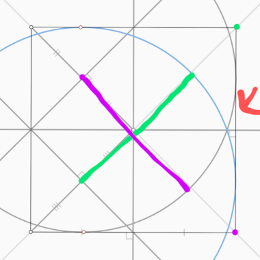
After creating a square and some circles used to demonstrate the corner radius, I used Android’s “advanced screenshot markup tool” to highlight the corner circle’s radius, colored with it’s matching corner.
Since the radius for each of the right corners of the square are set to 75% of the edge length, you can see that the two corner radii intersect within the bounds of the square. That leaves us with a couple of choices about how to handle this shape.
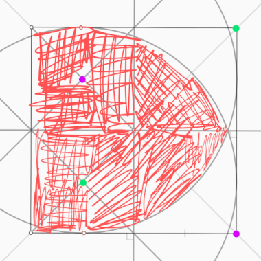
The screenshot below illustrates the choice that Apple made. You can see that they appear to apply the corner radius to each corner individually and then select the intersection of the resulting circles. This results in a shape that no longer shares the same bounds as the original square.

In my discussion of this point in that graphics forum, I suggested that when rounding the corners of a shape you have 360° available, and if the sum of any adjacent corners is more than the length of the connecting edge then you’re asking for a circle of more than 360°, which isn’t possible.
To avoid the weird situation with Apple’s approach, the Android UI toolkit restricts corner radii to half of the shortest edge. This prevents developers from creating a situation in which they’re presented with a surprising shape. It’s possible that this is more of a risk on Android than elsewhere given it’s extensive support for responsive layouts.
A simple demonstration⌗
After this discussion, I couldn’t help thinking that the results of longer corner radii would be almost trivial to demonstrate using Jetpack Compose’s Canvas element and a simple preview.
This demo simply allows you to adjust the corner radius of the squares using the slider. The top four square only apply the radius to a single corner, and things generally look fine. But once you apply the radius to adjacent corners, as can be seen in the bottom square, the results can be quite surprising.
If you’d like to play with this example, you can check out the source code here.
Final thoughts⌗
In my opinion, the Android approach of limiting corner radii to half of the shortest edge length is a reasonable choice, especially for a UI toolkit, as it helps protect developers from ending up with surprising shapes in their UI.
As a bonus, this discussion served as a great example of how valuable quick UI tools can be to ask and answer questions. I loved being able to use Compose, along with Android Studio’s interactive preview, to experiment with this.
Thanks for asking the question, Michał!