Bringing Fragment to Android

In November 2013, Ben Guerrette from Pixite reached out to me after reading my post about my experience being featured on the Google Play. He was interested in bringing one of their iOS photo apps to Android.
At this point I wasn’t familiar with Pixite, so I promptly fired up the Google to do my research. I was quite impressed with what I found. The guys at Pixite had created some really cool photo apps for iOS, and when I searched Google Play for similar offerings on Android, I found next to nothing.
What I really liked about the Pixite apps was that they weren’t your standard sepia or vignette filters, but truly creative tools to help people make unique, creative art. After many emails, and several phone calls with the team, we decided to team to up bring a new type of creativity to the Play Store.
Initial Design Review⌗
Before writing any code, I started by getting really familiar with the iOS version of the app and how it worked. I had to have a good feel for the app so that I could determine how that best translates to Android.
Fragment is a beautiful app. One of the things that I really enjoyed about it was that though it has some auxiliary screens, the main app is a single edit screen.
In this edit screen is a wonderful collection of custom controls. Fragment is all about swiping your way to creativity, and I think that is beautifully crafted into thoughtful controls that make for a truly engaging experience.
Though I’m primarily a developer, not a designer, clients hire me because of my Android expertise. I therefore like to make recommendations to ensure the best user experience. I want to make apps that users love and that feel natural for the platform they are on.
Countless times I have had clients hold the iPhone and Android apps next to each other and complain when things don’t look exactly the same. What these people don’t realize is that users don’t do that. Android users don’t care if their apps look exactly like their iOS counterparts, they want the apps to look and work like Android apps.
Fortunately Fragment has a very custom UI, with custom components that aren’t specific to their platform. The only real changes required were removing some ‘X’ buttons, since Android devices have a back button, and changing the export screen, since Android allows you to share with any installed apps.
As I made my recommendations, the Pixite team was very supportive, since they, too, just want to make the best user experience possible.
Reusing Code⌗
One of the nice things about Fragment already having been released on iOS is that the developers at Pixite had already worked through many iterations to make the app rock solid. They had already thought about certain implementation details that I wouldn’t have to rediscover.

That being said, Android and iOS use two different languages, and work in very different ways, so the code itself isn’t simply transferrable. Even much of the app architecture was changed to fit Android and fully take advantage of it’s capabilities. This is no simple drag and drop conversion.
On the other hand, much of the app makes use of OpenGL Shaders, which are platform independent. This meant that, while I did have to write the majority of the app from scratch, I could use the exact same shaders from the iOS app. (It also meant that I didn’t have to learn GLSL.)
Learning OpenGL⌗
Speaking of learning new things, one of the biggest challenges I had was the fact that I had never programmed anything with OpenGL before. Okay, that’s not quite true, I did once make a breakout clone with a friend who is a game developer so that I could learn, but that’s about it.
The rest of the interaction with OpenGL I had to learn as I wrote the app. I started out simple, but eventually got into touch interaction and complex configuration.
Fortunately, while the Java OpenGL code for Android isn’t quite the same as the Objective-C equivelant, it’s close enough, and I have enough iOS developemnt experience, that I was able to reference the iOS as needed for some helpful pointers. That also meant that Scott, Pixite’s lead iOS dev, was a great resource.
Overall the learning process went quite well. I was able to get a simple Fragment app working in a relatively short amount of time, leaving the rest for fine tuning and refinement.
Testing⌗
A few weeks before launch, after over 7 months of developemnt, we released Fragment to a small group of beta testers. These users were extremely talented power users who had been requesting an Android version of the app for a while now. They gave us some great feedback to help make the app really kick ass.
Shortly after that, we shared the app with the editors at Android Central and they liked it so much that they wanted to make Fragment the theme of their next weekly photo contest. We decided to open up the beta to anyone who would like to join and were met with over 650 participants.
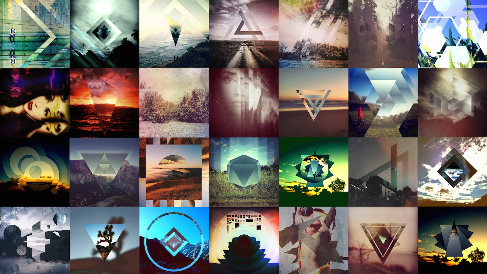
The initial reaction to Fragment has been wonderful. Users from all over the world are using the app to create stunning graphics, much better than I could do. That’s kind of an interesting point, because I’ve been using the app for the last 8 months during developemnt, and many of our users can make better stuff after just a few minutes.

Launch⌗
And here we are. After 8 months of development, Fragment is finally ready for the public. We’ve worked really hard to make an amazing app that we hope everyone will enjoy.
I think we’ve build a really solid, top notch app that will help users make amazing visual art. Head over to the play store and give it a try.
